Examples of Data Visualization

By Aliya Uteuova

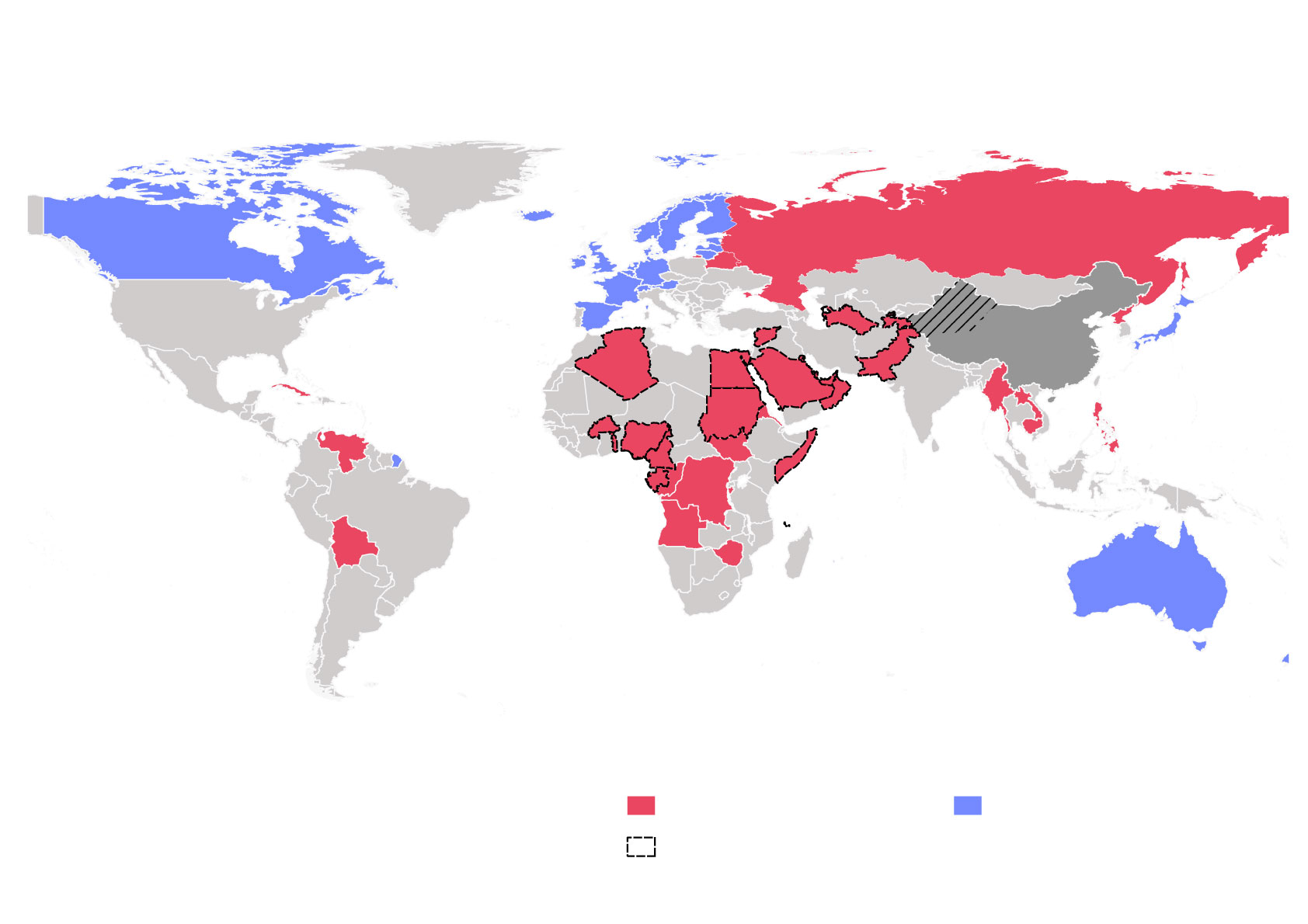
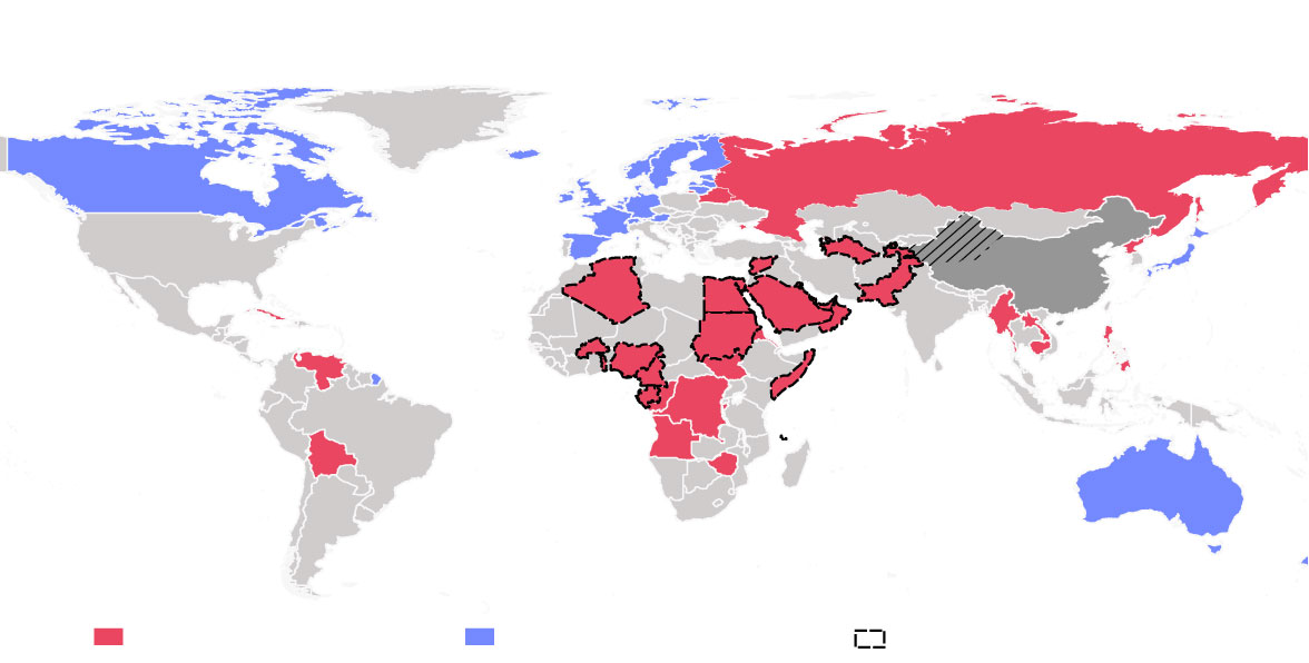
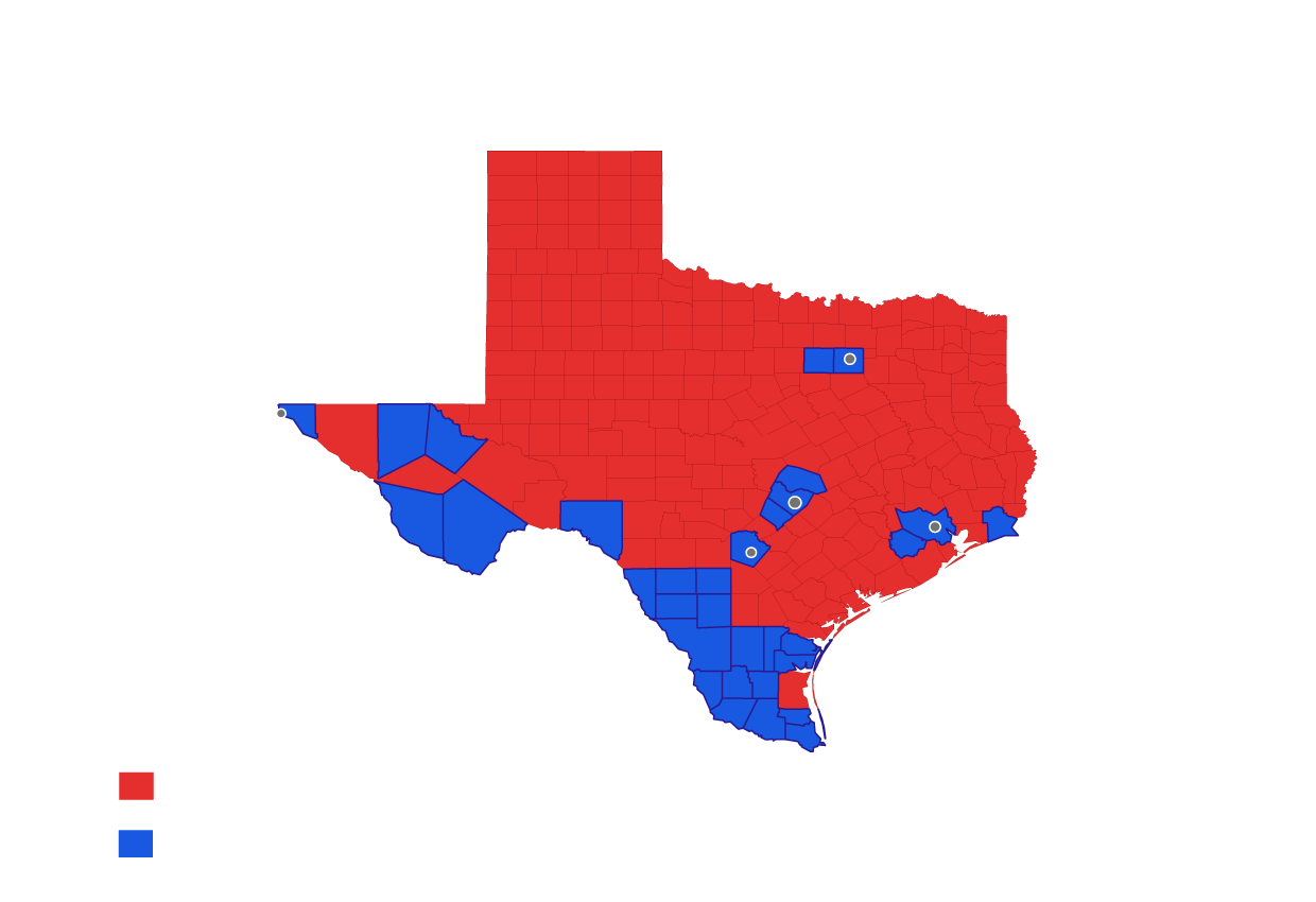
Below is an example of a map I created using a geographic information system software QGIS. I analyzed and edited spatial information with which I composed a graphical maps.

Additionally, I polished up the map using Adobe Illustrator. I also made this map responsive using ai2html. If you minimize the window size or view it on a mobile device, different images of the same information will be shown.

Who cares about China’s Muslims?


In July 2019, 59 countries responded to China’s reeducation of

Uighurs, Kazakhs, and other Turkic Muslims in Xinjiang

Xinjiang

37 countries supporting China

22 countries condemning China

Islamic Cooperation Member Nations

Source: UN Human Rights Council

Who cares about China’s Muslims?


Source: UN Human Rights Council

Xinjiang

22 countries condemning China

37 countries supporting China

Islamic Cooperation Member Nations

China’s Foreign Direct Investment into the supporting and condemning countries between 2017-2019

billion dollars

I made the graphic below using a plotting tool Matplotlib. I analyzed the historical dataset using Python and Excel and finished it up with Adobe Illustrator touch-ups.

This is an example of a map created using QGIS. I scraped the 2018 midterm election results using Python. The map is also responsive when the window is minimized or when viewed on mobile devices.

2018 Texas Senate Race

Dallas

El Paso

Houston

Austin

San Antonio

Ted Cruz (R)

Beto O’Rourke (D)

Source: Washington Post

Votes

Candidates

Pct.

Ted Cruz (R)

4,260,553

50.9%

Beto O’Rourke (D)

4,045,632

48.3%

Source: Washington Post


Candidates

Pct.

Ted Cruz (R)

50.9%

Beto O’Rourke (D)

48.3%

Source: Washington Post